<!DOCTYPE html>
<html lang="en">
<head>
    <meta charset="UTF-8">
    <meta name="viewport" content="width=device-width, initial-scale=1.0">
        <title>Creativekidsstuff - Delight Customers with Creativekidsstuff's Solutions</title>

    <script src="https://cdn.tailwindcss.com"></script>
    
    <link href="https://cdnjs.cloudflare.com/ajax/libs/flowbite/2.2.0/flowbite.min.css" rel="stylesheet" />
    <link rel="stylesheet" href="https://cdnjs.cloudflare.com/ajax/libs/font-awesome/6.4.0/css/all.min.css">
    <link rel="preconnect" href="https://fonts.googleapis.com">
    <link rel="preconnect" href="https://fonts.gstatic.com" crossorigin>
    <link href="https://fonts.googleapis.com/css2?family=Inter:wght@300;400;500;600;700;800;900&family=Plus+Jakarta+Sans:wght@300;400;500;600;700;800;900&display=swap" rel="stylesheet">

    <style>
        html {
            scroll-behavior: smooth;
        }

        body {
            font-family: 'Inter', sans-serif;
        }
        h1, h2, h3, h4, h5, h6 {
            font-family: 'Plus Jakarta Sans', sans-serif;
        }

        .gradient-text {
            background: linear-gradient(135deg, var(--tw-gradient-from), var(--tw-gradient-to));
            -webkit-background-clip: text;
            -webkit-text-fill-color: transparent;
            background-clip: text;
        }

        .glass-effect {
            background: rgba(255, 255, 255, 0.9);
            backdrop-filter: blur(10px);
            -webkit-backdrop-filter: blur(10px);
        }

        .hover-lift {
            transition: transform 0.3s ease, box-shadow 0.3s ease;
        }

        .hover-lift:hover {
            transform: translateY(-8px);
            box-shadow: 0 20px 40px rgba(0, 0, 0, 0.15);
        }

        @keyframes float {
            0%, 100% { transform: translateY(0); }
            50% { transform: translateY(-20px); }
        }

        .animate-float {
            animation: float 6s ease-in-out infinite;
        }

        .pattern-dots {
            background-image: radial-gradient(circle, rgba(0,0,0,0.05) 1px, transparent 1px);
            background-size: 20px 20px;
        }

        .section-divider {
            position: relative;
            overflow: hidden;
        }

        .section-divider::before {
            content: '';
            position: absolute;
            top: -50%;
            left: -10%;
            width: 120%;
            height: 200%;
            background: linear-gradient(135deg, transparent 45%, rgba(255,255,255,0.03) 50%, transparent 55%);
            transform: rotate(-5deg);
        }
    </style>
    <link rel="stylesheet" href="assets/css/dynamic.css">
</head>
<body class="antialiased">

<nav class="fixed w-full z-50 top-0 bg-gradient-to-r from-gray-900 to-gray-800 text-white shadow-xl">
    <div class="max-w-screen-xl flex flex-wrap items-center justify-between mx-auto px-6 py-2">
        <a href="./" class="flex items-center space-x-3">
            <div class="w-10 h-10 bg-gradient-to-br from-amber-500 to-yellow-600 rounded-lg flex items-center justify-center">
                <span class="text-white font-bold">C</span>
            </div>
            <span class="self-center text-xl font-bold">
                Creativekidsstuff            </span>
        </a>
        <button data-collapse-toggle="navbar-default" type="button" class="inline-flex items-center p-2 w-10 h-10 justify-center text-sm text-white rounded-lg md:hidden hover:bg-white/10">
            <svg class="w-5 h-5" fill="none" viewBox="0 0 17 14">
                <path stroke="currentColor" stroke-linecap="round" stroke-linejoin="round" stroke-width="2" d="M1 1h15M1 7h15M1 13h15"/>
            </svg>
        </button>
        <div class="hidden w-full md:block md:w-auto" id="navbar-default">
            <ul class="font-medium flex flex-col md:flex-row md:space-x-6 items-center">
                <li><a href="#services" class="block py-2 px-3 text-white/80 hover:text-white transition-colors">Services</a></li>
                <li><a href="#features" class="block py-2 px-3 text-white/80 hover:text-white transition-colors">Features</a></li>
                <li><a href="#about" class="block py-2 px-3 text-white/80 hover:text-white transition-colors">About</a></li>
                <li><a href="#testimonials" class="block py-2 px-3 text-white/80 hover:text-white transition-colors">Testimonials</a></li>
                <li>
                    <a href="#contact" class="block py-2.5 px-6 bg-white text-gray-900 rounded-lg hover:bg-gray-100 transition-all font-semibold">
                        Get Started
                    </a>
                </li>
            </ul>
        </div>
    </div>
</nav>


<section class="relative min-h-screen flex items-center bg-white overflow-hidden mt-16">
    <div class="absolute inset-0 bg-gradient-to-br from-amber-50/50 via-white to-yellow-50/50"></div>
    <div class="max-w-screen-xl mx-auto px-4 py-20 relative z-10">
        <div class="grid lg:grid-cols-2 gap-16 items-center">
            <div class="space-y-8">
                <div class="inline-flex items-center gap-2 px-5 py-2.5 bg-amber-100 text-amber-700 rounded-full text-sm font-semibold">
                    <i class="fas fa-bolt"></i>
                    Restaurant Excellence                </div>
                <h1 class="text-5xl md:text-6xl lg:text-7xl font-black text-gray-900 leading-tight">
                    Delight Customers with Creativekidsstuff's Solutions                </h1>
                <p class="text-xl md:text-2xl text-gray-600 leading-relaxed">
                    Streamline kitchen operations, optimize table management, and delight every customer with Creativekidsstuff.                </p>
                <div class="flex flex-col sm:flex-row gap-4">
                    <a href="#contact" class="group px-8 py-4 bg-gradient-to-r from-amber-600 to-yellow-600 text-white font-bold rounded-xl hover:shadow-2xl hover:scale-105 transition-all flex items-center justify-center gap-3">
                        Optimize operations                        <i class="fas fa-arrow-right group-hover:translate-x-2 transition-transform"></i>
                    </a>
                    <a href="#services" class="px-8 py-4 bg-white border-2 border-gray-300 text-gray-900 font-bold rounded-xl hover:bg-gray-50 hover:shadow-lg transition-all flex items-center justify-center gap-3">
                        <i class="fas fa-play-circle"></i>
                        Watch Demo
                    </a>
                </div>
                <div class="flex items-center gap-8 pt-8 border-t border-gray-200">
                    <div>
                        <div class="text-3xl font-black text-amber-600">10K+</div>
                        <div class="text-sm text-gray-600 font-semibold">Active Users</div>
                    </div>
                    <div class="w-px h-12 bg-gray-300"></div>
                    <div>
                        <div class="text-3xl font-black text-yellow-600">4.9★</div>
                        <div class="text-sm text-gray-600 font-semibold">Rating</div>
                    </div>
                    <div class="w-px h-12 bg-gray-300"></div>
                    <div>
                        <div class="text-3xl font-black text-gray-900">24/7</div>
                        <div class="text-sm text-gray-600 font-semibold">Support</div>
                    </div>
                </div>
            </div>
            <div class="relative">
                <div class="relative z-10">
                    <div class="absolute -inset-6 bg-gradient-to-r from-amber-400 to-yellow-500 rounded-3xl blur-2xl opacity-30"></div>
                    <img src="https://images.pexels.com/photos/1024359/pexels-photo-1024359.jpeg?auto=compress&cs=tinysrgb&dpr=2&h=650&w=940" alt="Creativekidsstuff" class="relative rounded-3xl shadow-2xl border-8 border-white">
                </div>
                <div class="absolute -bottom-8 -right-8 w-64 h-64 bg-amber-200 rounded-full blur-3xl opacity-50"></div>
                <div class="absolute -top-8 -left-8 w-48 h-48 bg-yellow-200 rounded-full blur-3xl opacity-50"></div>
            </div>
        </div>
    </div>
</section>


<section class="bg-white py-16">
    <div class="max-w-screen-xl mx-auto px-4">
        <div class="grid grid-cols-2 md:grid-cols-4 gap-6">
            <div class="text-center p-6 bg-gray-50 rounded-xl">
                <div class="text-4xl font-black text-amber-600 mb-2">500+</div>
                <div class="text-gray-600 text-sm">Happy Clients</div>
            </div>
            <div class="text-center p-6 bg-gray-50 rounded-xl">
                <div class="text-4xl font-black text-amber-600 mb-2">98%</div>
                <div class="text-gray-600 text-sm">Satisfaction Rate</div>
            </div>
            <div class="text-center p-6 bg-gray-50 rounded-xl">
                <div class="text-4xl font-black text-amber-600 mb-2">24/7</div>
                <div class="text-gray-600 text-sm">Support Available</div>
            </div>
            <div class="text-center p-6 bg-gray-50 rounded-xl">
                <div class="text-4xl font-black text-amber-600 mb-2">15+</div>
                <div class="text-gray-600 text-sm">Years Experience</div>
            </div>
        </div>
    </div>
</section>

<section class="relative bg-gray-900 py-20 overflow-hidden" id="services">
    <div class="absolute inset-0 bg-gradient-to-br from-amber-900/20 to-yellow-900/20"></div>
    
    <div class="max-w-screen-xl mx-auto px-4 relative z-10">
        <div class="text-center mb-16">
            <span class="inline-block px-4 py-2 bg-white/10 text-white rounded-full text-sm font-semibold mb-4">Services</span>
            <h2 class="text-5xl font-extrabold text-white mb-4">Complete Restaurant Solutions</h2>
            <p class="text-xl text-gray-300 max-w-2xl mx-auto">Professional solutions for every need</p>
        </div>
        
        <div class="grid md:grid-cols-3 gap-6">
                        <div class="bg-white/5 backdrop-blur-sm border border-white/10 rounded-2xl p-8 hover:bg-white/10 transition-all">
                <div class="w-14 h-14 bg-gradient-to-br from-amber-500 to-yellow-600 rounded-xl flex items-center justify-center mb-6">
                    <i class="fas fa-briefcase text-white text-2xl"></i>
                </div>
                <h3 class="text-xl font-bold text-white mb-3">Inventory Control</h3>
                <p class="text-gray-300 leading-relaxed">Real-time inventory tracking, recipe costing, and automated purchasing to reduce waste</p>
            </div>
                        <div class="bg-white/5 backdrop-blur-sm border border-white/10 rounded-2xl p-8 hover:bg-white/10 transition-all">
                <div class="w-14 h-14 bg-gradient-to-br from-amber-500 to-yellow-600 rounded-xl flex items-center justify-center mb-6">
                    <i class="fas fa-chart-line text-white text-2xl"></i>
                </div>
                <h3 class="text-xl font-bold text-white mb-3">POS System</h3>
                <p class="text-gray-300 leading-relaxed">Fast, reliable point of sale with integrated payment processing and real-time reporting</p>
            </div>
                        <div class="bg-white/5 backdrop-blur-sm border border-white/10 rounded-2xl p-8 hover:bg-white/10 transition-all">
                <div class="w-14 h-14 bg-gradient-to-br from-amber-500 to-yellow-600 rounded-xl flex items-center justify-center mb-6">
                    <i class="fas fa-handshake text-white text-2xl"></i>
                </div>
                <h3 class="text-xl font-bold text-white mb-3">Guest Loyalty</h3>
                <p class="text-gray-300 leading-relaxed">Build lasting relationships with loyalty programs, marketing automation, and feedback tools</p>
            </div>
                        <div class="bg-white/5 backdrop-blur-sm border border-white/10 rounded-2xl p-8 hover:bg-white/10 transition-all">
                <div class="w-14 h-14 bg-gradient-to-br from-amber-500 to-yellow-600 rounded-xl flex items-center justify-center mb-6">
                    <i class="fas fa-building text-white text-2xl"></i>
                </div>
                <h3 class="text-xl font-bold text-white mb-3">Table Management</h3>
                <p class="text-gray-300 leading-relaxed">Optimize seating, manage reservations, and reduce wait times with intelligent table turnover</p>
            </div>
                        <div class="bg-white/5 backdrop-blur-sm border border-white/10 rounded-2xl p-8 hover:bg-white/10 transition-all">
                <div class="w-14 h-14 bg-gradient-to-br from-amber-500 to-yellow-600 rounded-xl flex items-center justify-center mb-6">
                    <i class="fas fa-users text-white text-2xl"></i>
                </div>
                <h3 class="text-xl font-bold text-white mb-3">Online Ordering</h3>
                <p class="text-gray-300 leading-relaxed">Seamless online ordering with delivery management and third-party integration</p>
            </div>
                        <div class="bg-white/5 backdrop-blur-sm border border-white/10 rounded-2xl p-8 hover:bg-white/10 transition-all">
                <div class="w-14 h-14 bg-gradient-to-br from-amber-500 to-yellow-600 rounded-xl flex items-center justify-center mb-6">
                    <i class="fas fa-trophy text-white text-2xl"></i>
                </div>
                <h3 class="text-xl font-bold text-white mb-3">Staff Management</h3>
                <p class="text-gray-300 leading-relaxed">Smart scheduling, time tracking, and payroll integration to optimize labor costs</p>
            </div>
                    </div>
    </div>
</section>

<section class="py-24 bg-gradient-to-br from-amber-50 via-white to-yellow-50" id="testimonials">
    <div class="max-w-screen-xl mx-auto px-4">
        <div class="text-center mb-16">
            <div class="inline-flex items-center gap-2 px-5 py-2.5 bg-amber-100 text-amber-700 rounded-full text-sm font-semibold mb-6">
                <i class="fas fa-star"></i>
                Testimonials
            </div>
            <h2 class="text-5xl md:text-6xl font-black text-gray-900 mb-4">What Our Clients Say</h2>
        </div>
        <div class="grid md:grid-cols-3 gap-8">
                        <div class="bg-white rounded-2xl p-8 shadow-xl border-2 border-gray-100 hover:border-amber-200 transition-all">
                <div class="flex items-center mb-4">
                                        <i class="fas fa-star text-yellow-400 text-lg"></i>
                                        <i class="fas fa-star text-yellow-400 text-lg"></i>
                                        <i class="fas fa-star text-yellow-400 text-lg"></i>
                                        <i class="fas fa-star text-yellow-400 text-lg"></i>
                                        <i class="fas fa-star text-yellow-400 text-lg"></i>
                                    </div>
                <p class="text-gray-700 mb-6 leading-relaxed text-lg">
                    "Managing five locations became manageable. Real-time reporting and analytics are invaluable."
                </p>
                <div class="flex items-center gap-4">
                    <img src="https://randomuser.me/api/portraits/men/89.jpg" alt="Michael O'Brien" class="w-14 h-14 rounded-full object-cover border-2 border-amber-200">
                    <div>
                        <div class="font-black text-gray-900">Michael O'Brien</div>
                        <div class="text-sm text-gray-600">Multi-Unit Owner, Coastal Restaurants Group</div>
                    </div>
                </div>
            </div>
                        <div class="bg-white rounded-2xl p-8 shadow-xl border-2 border-gray-100 hover:border-amber-200 transition-all">
                <div class="flex items-center mb-4">
                                        <i class="fas fa-star text-yellow-400 text-lg"></i>
                                        <i class="fas fa-star text-yellow-400 text-lg"></i>
                                        <i class="fas fa-star text-yellow-400 text-lg"></i>
                                        <i class="fas fa-star text-yellow-400 text-lg"></i>
                                        <i class="fas fa-star text-yellow-400 text-lg"></i>
                                    </div>
                <p class="text-gray-700 mb-6 leading-relaxed text-lg">
                    "POS integration and staff scheduling simplified our daily operations. Best investment we've made."
                </p>
                <div class="flex items-center gap-4">
                    <img src="https://randomuser.me/api/portraits/men/59.jpg" alt="David Park" class="w-14 h-14 rounded-full object-cover border-2 border-amber-200">
                    <div>
                        <div class="font-black text-gray-900">David Park</div>
                        <div class="text-sm text-gray-600">General Manager, Harbor Grill</div>
                    </div>
                </div>
            </div>
                        <div class="bg-white rounded-2xl p-8 shadow-xl border-2 border-gray-100 hover:border-amber-200 transition-all">
                <div class="flex items-center mb-4">
                                        <i class="fas fa-star text-yellow-400 text-lg"></i>
                                        <i class="fas fa-star text-yellow-400 text-lg"></i>
                                        <i class="fas fa-star text-yellow-400 text-lg"></i>
                                        <i class="fas fa-star text-yellow-400 text-lg"></i>
                                        <i class="fas fa-star text-yellow-400 text-lg"></i>
                                    </div>
                <p class="text-gray-700 mb-6 leading-relaxed text-lg">
                    "Event management and client communication became effortless. We handle twice the volume with ease."
                </p>
                <div class="flex items-center gap-4">
                    <img src="https://randomuser.me/api/portraits/men/99.jpg" alt="Sofia Garcia" class="w-14 h-14 rounded-full object-cover border-2 border-amber-200">
                    <div>
                        <div class="font-black text-gray-900">Sofia Garcia</div>
                        <div class="text-sm text-gray-600">Catering Director, Prestige Catering</div>
                    </div>
                </div>
            </div>
                    </div>
    </div>
</section>


<section class="bg-white py-20" id="features">
    <div class="max-w-screen-xl mx-auto px-4">
        <div class="text-center mb-16">
            <span class="inline-block px-6 py-2 bg-amber-100 text-amber-800 rounded-full text-sm font-semibold mb-4">Features</span>
            <h2 class="text-5xl font-black text-gray-900 mb-4">Why Choose Us</h2>
            <p class="text-xl text-gray-600">Premium features for exceptional results</p>
        </div>
        
        <div class="grid md:grid-cols-2 lg:grid-cols-4 gap-6">
                        <div class="group p-6 bg-gray-50 rounded-2xl hover:bg-white hover:shadow-xl transition-all">
                <div class="w-14 h-14 bg-gradient-to-br from-amber-500 to-yellow-600 rounded-xl flex items-center justify-center mb-4 group-hover:scale-110 transition-transform">
                    <i class="fas fa-bolt text-white text-xl"></i>
                </div>
                <h3 class="text-lg font-bold text-gray-900 mb-2">Fast</h3>
                <p class="text-gray-600 text-sm">Lightning speed</p>
            </div>
                        <div class="group p-6 bg-gray-50 rounded-2xl hover:bg-white hover:shadow-xl transition-all">
                <div class="w-14 h-14 bg-gradient-to-br from-amber-500 to-yellow-600 rounded-xl flex items-center justify-center mb-4 group-hover:scale-110 transition-transform">
                    <i class="fas fa-lock text-white text-xl"></i>
                </div>
                <h3 class="text-lg font-bold text-gray-900 mb-2">Secure</h3>
                <p class="text-gray-600 text-sm">Bank security</p>
            </div>
                        <div class="group p-6 bg-gray-50 rounded-2xl hover:bg-white hover:shadow-xl transition-all">
                <div class="w-14 h-14 bg-gradient-to-br from-amber-500 to-yellow-600 rounded-xl flex items-center justify-center mb-4 group-hover:scale-110 transition-transform">
                    <i class="fas fa-mobile-alt text-white text-xl"></i>
                </div>
                <h3 class="text-lg font-bold text-gray-900 mb-2">Mobile</h3>
                <p class="text-gray-600 text-sm">All devices</p>
            </div>
                        <div class="group p-6 bg-gray-50 rounded-2xl hover:bg-white hover:shadow-xl transition-all">
                <div class="w-14 h-14 bg-gradient-to-br from-amber-500 to-yellow-600 rounded-xl flex items-center justify-center mb-4 group-hover:scale-110 transition-transform">
                    <i class="fas fa-sync text-white text-xl"></i>
                </div>
                <h3 class="text-lg font-bold text-gray-900 mb-2">Updated</h3>
                <p class="text-gray-600 text-sm">Always current</p>
            </div>
                        <div class="group p-6 bg-gray-50 rounded-2xl hover:bg-white hover:shadow-xl transition-all">
                <div class="w-14 h-14 bg-gradient-to-br from-amber-500 to-yellow-600 rounded-xl flex items-center justify-center mb-4 group-hover:scale-110 transition-transform">
                    <i class="fas fa-users text-white text-xl"></i>
                </div>
                <h3 class="text-lg font-bold text-gray-900 mb-2">Team</h3>
                <p class="text-gray-600 text-sm">Collaboration</p>
            </div>
                        <div class="group p-6 bg-gray-50 rounded-2xl hover:bg-white hover:shadow-xl transition-all">
                <div class="w-14 h-14 bg-gradient-to-br from-amber-500 to-yellow-600 rounded-xl flex items-center justify-center mb-4 group-hover:scale-110 transition-transform">
                    <i class="fas fa-chart-bar text-white text-xl"></i>
                </div>
                <h3 class="text-lg font-bold text-gray-900 mb-2">Analytics</h3>
                <p class="text-gray-600 text-sm">Insights</p>
            </div>
                        <div class="group p-6 bg-gray-50 rounded-2xl hover:bg-white hover:shadow-xl transition-all">
                <div class="w-14 h-14 bg-gradient-to-br from-amber-500 to-yellow-600 rounded-xl flex items-center justify-center mb-4 group-hover:scale-110 transition-transform">
                    <i class="fas fa-cloud text-white text-xl"></i>
                </div>
                <h3 class="text-lg font-bold text-gray-900 mb-2">Cloud</h3>
                <p class="text-gray-600 text-sm">Anywhere</p>
            </div>
                        <div class="group p-6 bg-gray-50 rounded-2xl hover:bg-white hover:shadow-xl transition-all">
                <div class="w-14 h-14 bg-gradient-to-br from-amber-500 to-yellow-600 rounded-xl flex items-center justify-center mb-4 group-hover:scale-110 transition-transform">
                    <i class="fas fa-cog text-white text-xl"></i>
                </div>
                <h3 class="text-lg font-bold text-gray-900 mb-2">Custom</h3>
                <p class="text-gray-600 text-sm">Tailored</p>
            </div>
                    </div>
    </div>
</section>


<section class="relative py-32" id="about" style="background-image: linear-gradient(135deg, #667eea 0%, #764ba2 100%);">
    <div class="absolute inset-0 bg-black/30"></div>
    
    <div class="relative z-10 max-w-screen-xl mx-auto px-4">
        <div class="grid lg:grid-cols-5 gap-12 items-center">
            <div class="lg:col-span-2">
                <div class="relative">
                    <div class="absolute -inset-4 bg-white/20 rounded-3xl blur-2xl"></div>
                    <img src="https://images.pexels.com/photos/3229076/pexels-photo-3229076.png?auto=compress&cs=tinysrgb&dpr=2&h=650&w=940" alt="About" class="relative rounded-2xl shadow-2xl w-full">
                </div>
            </div>
            
            <div class="lg:col-span-3 text-white">
                <span class="inline-block px-4 py-2 bg-white/20 backdrop-blur-sm rounded-full text-sm font-bold mb-6">
                    Restaurant Excellence                </span>
                
                <h2 class="text-6xl font-black mb-8 leading-tight">
                    Streamline kitchen operations with real-time orders                </h2>
                
                <p class="text-2xl text-white/90 mb-10 leading-relaxed">
                    Our comprehensive restaurant management platform helps you deliver exceptional dining experiences while streamlining operations. From reservations to inventory, everything in one place.                </p>
                
                <div class="flex items-center space-x-8 mb-10">
                    <div class="text-center">
                        <div class="text-5xl font-black mb-2">12+</div>
                        <div class="text-sm text-white/80">Years</div>
                    </div>
                    <div class="w-px h-20 bg-white/30"></div>
                    <div class="text-center">
                        <div class="text-5xl font-black mb-2">8K+</div>
                        <div class="text-sm text-white/80">Projects</div>
                    </div>
                    <div class="w-px h-20 bg-white/30"></div>
                    <div class="text-center">
                        <div class="text-5xl font-black mb-2">99%</div>
                        <div class="text-sm text-white/80">Success</div>
                    </div>
                </div>
                
                <a href="#contact" class="inline-block px-12 py-6 bg-white text-purple-600 font-black text-lg rounded-full hover:bg-gray-100 transition-all">
                    Transform your restaurant                </a>
            </div>
        </div>
    </div>
</section>


<section class="py-24 bg-gradient-to-br from-amber-50 via-white to-yellow-50" id="blog">
    <div class="max-w-screen-xl mx-auto px-4">
        <div class="text-center mb-16">
            <div class="inline-flex items-center gap-2 px-5 py-2.5 bg-white border-2 border-amber-200 text-amber-700 rounded-full text-sm font-semibold mb-6 shadow-lg">
                <i class="fas fa-book"></i>
                Blog
            </div>
            <h2 class="text-5xl md:text-6xl font-black text-gray-900">Latest Articles</h2>
        </div>
        <div class="grid md:grid-cols-2 lg:grid-cols-3 gap-8">
                        <article class="group bg-white rounded-3xl overflow-hidden shadow-lg hover:shadow-2xl transition-all border border-gray-100">
                <div class="relative h-56 overflow-hidden">
                    <img src="https://images.pexels.com/photos/3298634/pexels-photo-3298634.jpeg?auto=compress&cs=tinysrgb&h=650&w=940" alt="Chef Collective Innovation Hubs" class="w-full h-full object-cover group-hover:scale-110 transition-transform duration-700">
                    <div class="absolute top-4 left-4">
                        <span class="px-4 py-2 bg-white/90 backdrop-blur-sm text-amber-700 text-xs font-bold rounded-lg shadow-md">Innovation</span>
                    </div>
                </div>
                <div class="p-6">
                    <div class="flex items-center gap-2 mb-3 text-xs text-gray-500">
                        <div class="w-8 h-8 bg-amber-100 rounded-full flex items-center justify-center">
                            <i class="fas fa-calendar text-amber-600 text-xs"></i>
                        </div>
                        <span>February 4, 2026</span>
                    </div>
                    <h3 class="text-xl font-black text-gray-900 mb-3 group-hover:text-amber-600 transition-colors line-clamp-2">
                        <a href="/blog/chef-collective-innovation-hubs/">Chef Collective Innovation Hubs</a>
                    </h3>
                    <p class="text-gray-600 mb-4 leading-relaxed line-clamp-3 text-sm">
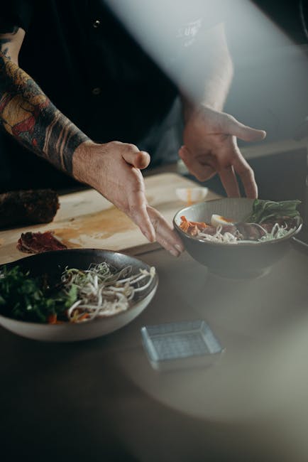
Chef collective innovation hubs let multi-brand restaurant groups prototype menus, tech, and training in 2025.</p>
                    <a href="/blog/chef-collective-innovation-hubs/" class="inline-flex items-center gap-2 text-amber-600 font-bold hover:gap-3 transition-all">
                        Read More
                        <i class="fas fa-arrow-right"></i>
                    </a>
                </div>
            </article>
                        <article class="group bg-white rounded-3xl overflow-hidden shadow-lg hover:shadow-2xl transition-all border border-gray-100">
                <div class="relative h-56 overflow-hidden">
                    <img src="https://images.pexels.com/photos/5779787/pexels-photo-5779787.jpeg?auto=compress&cs=tinysrgb&h=650&w=940" alt="Mastering Restaurant Management: Strategies for Success and Growth" class="w-full h-full object-cover group-hover:scale-110 transition-transform duration-700">
                    <div class="absolute top-4 left-4">
                        <span class="px-4 py-2 bg-white/90 backdrop-blur-sm text-amber-700 text-xs font-bold rounded-lg shadow-md">General</span>
                    </div>
                </div>
                <div class="p-6">
                    <div class="flex items-center gap-2 mb-3 text-xs text-gray-500">
                        <div class="w-8 h-8 bg-amber-100 rounded-full flex items-center justify-center">
                            <i class="fas fa-calendar text-amber-600 text-xs"></i>
                        </div>
                        <span>February 3, 2026</span>
                    </div>
                    <h3 class="text-xl font-black text-gray-900 mb-3 group-hover:text-amber-600 transition-colors line-clamp-2">
                        <a href="/blog/mastering-restaurant-management-strategies-for-success-and-growth/">Mastering Restaurant Management: Strategies for Success and Growth</a>
                    </h3>
                    <p class="text-gray-600 mb-4 leading-relaxed line-clamp-3 text-sm">In the competitive world of restaurant management, staying ahead requires a blend of strategic planning, operational eff...</p>
                    <a href="/blog/mastering-restaurant-management-strategies-for-success-and-growth/" class="inline-flex items-center gap-2 text-amber-600 font-bold hover:gap-3 transition-all">
                        Read More
                        <i class="fas fa-arrow-right"></i>
                    </a>
                </div>
            </article>
                        <article class="group bg-white rounded-3xl overflow-hidden shadow-lg hover:shadow-2xl transition-all border border-gray-100">
                <div class="relative h-56 overflow-hidden">
                    <img src="https://images.pexels.com/photos/3184192/pexels-photo-3184192.jpeg?auto=compress&cs=tinysrgb&h=650&w=940" alt="Zero-Waste Commissary Networks" class="w-full h-full object-cover group-hover:scale-110 transition-transform duration-700">
                    <div class="absolute top-4 left-4">
                        <span class="px-4 py-2 bg-white/90 backdrop-blur-sm text-amber-700 text-xs font-bold rounded-lg shadow-md">Sustainability</span>
                    </div>
                </div>
                <div class="p-6">
                    <div class="flex items-center gap-2 mb-3 text-xs text-gray-500">
                        <div class="w-8 h-8 bg-amber-100 rounded-full flex items-center justify-center">
                            <i class="fas fa-calendar text-amber-600 text-xs"></i>
                        </div>
                        <span>February 2, 2026</span>
                    </div>
                    <h3 class="text-xl font-black text-gray-900 mb-3 group-hover:text-amber-600 transition-colors line-clamp-2">
                        <a href="/blog/zero-waste-commissary-networks/">Zero-Waste Commissary Networks</a>
                    </h3>
                    <p class="text-gray-600 mb-4 leading-relaxed line-clamp-3 text-sm">Zero-waste commissary networks redistribute surplus ingredients across brands and donation channels in 2025.</p>
                    <a href="/blog/zero-waste-commissary-networks/" class="inline-flex items-center gap-2 text-amber-600 font-bold hover:gap-3 transition-all">
                        Read More
                        <i class="fas fa-arrow-right"></i>
                    </a>
                </div>
            </article>
                    </div>
        <div class="text-center mt-12">
            <a href="blog/" class="inline-flex items-center gap-3 px-10 py-5 bg-white border-2 border-amber-300 text-amber-700 font-black rounded-full hover:bg-amber-50 transition-all shadow-lg">
                View All Articles
                <i class="fas fa-arrow-right"></i>
            </a>
        </div>
    </div>
</section>


<section class="bg-white py-20">
    <div class="max-w-screen-xl mx-auto px-4">
        <div class="text-center mb-12">
            <h2 class="text-6xl font-black text-gray-900 mb-6">One More Thing...</h2>
            <p class="text-2xl text-gray-600">Don't let this opportunity pass you by</p>
        </div>
        
        <div class="max-w-5xl mx-auto">
            <div class="bg-gradient-to-br from-gray-50 to-white rounded-3xl p-12 lg:p-20 border-2 border-amber-100 shadow-xl">
                <div class="grid md:grid-cols-2 gap-12 items-center">
                    <div>
                        <h3 class="text-4xl font-black text-gray-900 mb-6">Get Instant Access</h3>
                        <ul class="space-y-4 mb-8">
                                                        <li class="flex items-start space-x-3">
                                <i class="fas fa-check-circle text-green-500 text-xl mt-1"></i>
                                <span class="text-lg text-gray-700">Complete onboarding guide</span>
                            </li>
                                                        <li class="flex items-start space-x-3">
                                <i class="fas fa-check-circle text-green-500 text-xl mt-1"></i>
                                <span class="text-lg text-gray-700">Personal success manager</span>
                            </li>
                                                        <li class="flex items-start space-x-3">
                                <i class="fas fa-check-circle text-green-500 text-xl mt-1"></i>
                                <span class="text-lg text-gray-700">Premium support included</span>
                            </li>
                                                        <li class="flex items-start space-x-3">
                                <i class="fas fa-check-circle text-green-500 text-xl mt-1"></i>
                                <span class="text-lg text-gray-700">Money-back guarantee</span>
                            </li>
                                                    </ul>
                        <a href="#contact" class="inline-block px-10 py-5 bg-gradient-to-r from-amber-600 to-yellow-600 text-white font-bold rounded-full hover:shadow-2xl transition-all">
                            Claim Your Access
                        </a>
                    </div>
                    
                    <div class="text-center">
                        <div class="inline-block bg-amber-600 text-white rounded-3xl p-12">
                            <div class="text-6xl font-black mb-2">FREE</div>
                            <div class="text-xl">Consultation</div>
                            <div class="text-sm opacity-75 mt-2">Worth $500</div>
                        </div>
                    </div>
                </div>
            </div>
        </div>
    </div>
</section>


<section class="bg-gradient-to-br from-gray-50 to-white py-20" id="contact">
    <div class="max-w-screen-md mx-auto px-4">
        <div class="text-center mb-12">
            <div class="inline-block px-4 py-2 mb-4 bg-amber-100 text-amber-800 rounded-full text-sm font-semibold">
                Get In Touch
            </div>
            <h2 class="text-4xl md:text-5xl font-extrabold text-gray-900 mb-4">Say Hello</h2>
            <p class="text-xl text-gray-600">Fill out the form below and our team will get back to you within 24 hours</p>
        </div>
        
        <form action="#" class="bg-white p-8 md:p-10 rounded-3xl shadow-2xl border border-gray-100">
            <div class="grid md:grid-cols-2 gap-6 mb-6">
                <div>
                    <label for="name" class="block mb-2 text-sm font-semibold text-gray-900">First Name</label>
                    <input type="text" id="name" class="bg-gray-50 border border-gray-300 text-gray-900 rounded-lg focus:ring-amber-500 focus:border-amber-500 block w-full p-3.5" placeholder="John" required>
                </div>
                <div>
                    <label for="lastname" class="block mb-2 text-sm font-semibold text-gray-900">Last Name</label>
                    <input type="text" id="lastname" class="bg-gray-50 border border-gray-300 text-gray-900 rounded-lg focus:ring-amber-500 focus:border-amber-500 block w-full p-3.5" placeholder="Doe" required>
                </div>
            </div>
            
            <div class="mb-6">
                <label for="email" class="block mb-2 text-sm font-semibold text-gray-900">Email Address</label>
                <input type="email" id="email" class="bg-gray-50 border border-gray-300 text-gray-900 rounded-lg focus:ring-amber-500 focus:border-amber-500 block w-full p-3.5" placeholder="john@example.com" required>
            </div>
            
            <div class="mb-6">
                <label for="subject" class="block mb-2 text-sm font-semibold text-gray-900">Subject</label>
                <select id="subject" class="bg-gray-50 border border-gray-300 text-gray-900 rounded-lg focus:ring-amber-500 focus:border-amber-500 block w-full p-3.5">
                    <option selected>Choose a topic</option>
                    <option value="general">General Inquiry</option>
                    <option value="support">Customer Support</option>
                    <option value="sales">Sales Question</option>
                    <option value="feedback">Feedback</option>
                </select>
            </div>
            
            <div class="mb-6">
                <label for="message" class="block mb-2 text-sm font-semibold text-gray-900">Message</label>
                <textarea id="message" rows="6" class="bg-gray-50 border border-gray-300 text-gray-900 rounded-lg focus:ring-amber-500 focus:border-amber-500 block w-full p-3.5" placeholder="Your message here..." required></textarea>
            </div>
            
            <button type="submit" class="w-full py-4 text-base font-bold text-white bg-gradient-to-r from-amber-600 to-yellow-600 rounded-lg hover:shadow-xl transition-all">
                Send Message →
            </button>
        </form>
        
        <div class="grid md:grid-cols-3 gap-6 mt-12 text-center">
            <div class="p-4">
                <div class="w-12 h-12 bg-amber-100 rounded-full flex items-center justify-center mx-auto mb-3">
                    <i class="fas fa-phone text-amber-600"></i>
                </div>
                <p class="text-sm font-semibold text-gray-900">+1-619-759-9409</p>
            </div>
            <div class="p-4">
                <div class="w-12 h-12 bg-amber-100 rounded-full flex items-center justify-center mx-auto mb-3">
                    <i class="fas fa-envelope text-amber-600"></i>
                </div>
                <p class="text-sm font-semibold text-gray-900">hello@creativekidsstuff.com</p>
            </div>
            <div class="p-4">
                <div class="w-12 h-12 bg-amber-100 rounded-full flex items-center justify-center mx-auto mb-3">
                    <i class="fas fa-map-marker-alt text-amber-600"></i>
                </div>
                <p class="text-sm font-semibold text-gray-900">369 Peachtree Street, Atlanta, GA 30303</p>
            </div>
        </div>
    </div>
</section>


<footer class="bg-gradient-to-br from-amber-600 to-yellow-700 text-white py-16">
    <div class="max-w-screen-xl mx-auto px-4">
        <div class="grid md:grid-cols-4 gap-12 mb-12">
            <div class="md:col-span-2">
                <a href="./" class="flex items-center space-x-3 mb-6">
                    <div class="w-14 h-14 bg-white/20 backdrop-blur-sm rounded-2xl flex items-center justify-center border border-white/30">
                        <span class="text-white font-bold text-2xl">C</span>
                    </div>
                    <span class="text-3xl font-black">Creativekidsstuff</span>
                </a>
                <p class="text-white/90 mb-6 max-w-md leading-relaxed">Empowering businesses with cutting-edge solutions and unparalleled expertise.</p>
                <div class="flex space-x-4">
                    <a href="#" class="w-12 h-12 bg-white/20 hover:bg-white/30 backdrop-blur-sm border border-white/30 rounded-xl flex items-center justify-center transition-all">
                        <i class="fab fa-facebook-f"></i>
                    </a>
                    <a href="#" class="w-12 h-12 bg-white/20 hover:bg-white/30 backdrop-blur-sm border border-white/30 rounded-xl flex items-center justify-center transition-all">
                        <i class="fab fa-twitter"></i>
                    </a>
                    <a href="#" class="w-12 h-12 bg-white/20 hover:bg-white/30 backdrop-blur-sm border border-white/30 rounded-xl flex items-center justify-center transition-all">
                        <i class="fab fa-linkedin-in"></i>
                    </a>
                    <a href="#" class="w-12 h-12 bg-white/20 hover:bg-white/30 backdrop-blur-sm border border-white/30 rounded-xl flex items-center justify-center transition-all">
                        <i class="fab fa-instagram"></i>
                    </a>
                </div>
            </div>
            <div>
                <h3 class="text-lg font-bold mb-6">Links</h3>
                <ul class="space-y-3 text-white/80">
                    <li><a href="./about-us.php" class="hover:text-white transition-colors">About</a></li>

                    <li><a href="blog/" class="hover:text-white transition-colors">Blog</a></li>
                    <li><a href="#services" class="hover:text-white transition-colors">Services</a></li>
                    <li><a href="#testimonials" class="hover:text-white transition-colors">Testimonials</a></li>
                    <li><a href="./contact.php" class="hover:text-white transition-colors">Contact</a></li>
                </ul>
            </div>
            <div>
                <h3 class="text-lg font-bold mb-6">Legal</h3>
                <ul class="space-y-3 text-white/80">
                    <li><a href="./privacy.php" class="hover:text-white transition-colors">Privacy</a></li>
                    <li><a href="./terms.php" class="hover:text-white transition-colors">Terms</a></li>
                    <li><a href="./disclaimer.php" class="hover:text-white transition-colors">Disclaimer</a></li>
                </ul>
            </div>
        </div>
        <div class="border-t border-white/20 pt-8">
            <p class="text-white/80 text-sm text-center">© 2026 Creativekidsstuff. All rights reserved.</p>
        </div>
    </div>
</footer>


<script src="https://cdnjs.cloudflare.com/ajax/libs/flowbite/2.2.0/flowbite.min.js"></script>

<script>
document.addEventListener('DOMContentLoaded', function() {
    const anchorLinks = document.querySelectorAll('a[href^="#"]');

    anchorLinks.forEach(link => {
        link.addEventListener('click', function(e) {
            const href = this.getAttribute('href');
            if (href === '#' || href === '') return;

            const targetId = href.substring(1);
            const targetElement = document.getElementById(targetId);

            if (targetElement) {
                e.preventDefault();
                const headerOffset = 80;
                const elementPosition = targetElement.getBoundingClientRect().top;
                const offsetPosition = elementPosition + window.pageYOffset - headerOffset;

                window.scrollTo({
                    top: offsetPosition,
                    behavior: 'smooth'
                });
            }
        });
    });
});
</script>

</body>
</html>
